One of the biggest design decisions you’ll make for your wedding is which colours you’ll use throughout the styling/ Of course, you don’t need to have a colour scheme… but it can help make certain decisions easier (like what colour chair sashes to have, or what colour the wedding party will be dressed in)
But, how do you choose a fabulous colour scheme? Some people seem to instinctively know which colours go together well, while others need a little more guidance.
Fortunately, there’s loads of great resources out there for just that (some of which I’ll be referencing throughout, so look out for links!), and I’m going to try and distil some of that information and make it wedding-friendly in the process
Whilst there are traditional or recommended colours for each season (pastels in spring, bright tones in summer, orange, brown and red in autumn and blues and silvers in winter), there’s absolutely no need to stick with that if you don’t want to.
So, assuming that you’re not sticking with the above schemes, how do you make sure your colours are going to look good together?
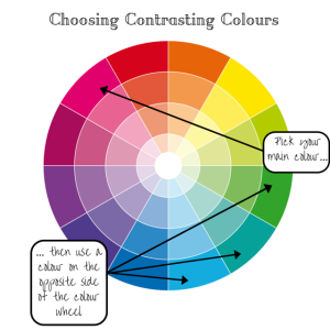
The first thing you’re going to need is a colour wheel. There’s loads available online, but I think this one is super pretty and has nicely defined shading for each colour too, so I’ll be using it throughout to illustrate what I mean
The reason these things are great is because they make it really easy to see which colours complement each other, and which provide a good contrast.
This colour wheel also has several shades of each colour, so if you only want one colour but aren’t keen on the ‘everything exactly the same shade’ approach, then using several shades of the same colour is a great way of easily coordinating everything, or for having an ‘ombre’ scheme (which has been very popular over the past couple of years)
For a complementary colour scheme: Select one colour on the colour wheel, along with the two colours immediately adjacent to it. Complementary colours create a sophisticated, elegant colour scheme
For contrasting colours: Pick one colour, and use the colour directly opposite it on the colour wheel. This makes each of the colours stand out against each other, and creates a bold colour scheme.
When you’re choosing your colours, make sure that they’re all of the same shade or tone. Again, this is where our friend the colour wheel comes in handy- all the colours on the same ‘ring’ are the same shade, and therefore will look good together
Generally speaking, you want to choose a maximum of 4 colours (not including black and white). You can have various shades of each colour within this, but resist the urge to have more individual colours than this (unless you’re going for rainbow themed, in which case pick a tone for all the colours and stick to that as much as possible to tie it all together. Whether you go bright rainbow or pastel, pick one and stick to it, and you’ll be well away)
There’s all sorts of other technical colour guideline, such as warm and cool colours. Essentially, any colour that is more blue than red or yellow is ‘cool’ and vice versa for ‘warm’. If you would like more information on this there’s lots available online ([here] and [here] are excellent), but for a wedding this generalisation will probably suffice
Neutrals are various shades of creams through all the browns to dark chocolate brown, and white through all the various greys to black. Cream/browns are always considered ‘warm’, where you can get ‘warm’ greys (imagine if you’ve made grey paint with black and cream) and ‘cool’ (imagine you’ve made grey using black and bright white).
Use neutrals in combination with colours to make the colours ‘pop’ or stand out, or on their own for a very subtle and sophisticated scheme. If you’re using colours with neutrals, traditionally you’d use ‘warm’ colours with ‘warm’ neutrals, and cool with cool, however try mixing them up, and if it looks good, go for it!
Neutral/Colour combos to try: Red/Cool Grey, Light Blue/Brown, Yellow/Warm Grey, Mint/Cool Grey, Orange/Brown, Sage/Cream
You can also use a strong tonal contrast. Black looks good with anything bright or pastel. White is great with black/grey, as well as bright colours and you can get some very interesting combinations with white/pastel schemes. Navy, like black, works brilliantly with brights and pastels whether they’re warm or cool tones.
Gold and silver should be teamed with warm colours and cool colours respectively, but as with neutrals it’s always worth trying both if you’re considering either as a metallic accent. I’d avoid silver and green, silver and orange and silver and yellow, but otherwise, gold and silver can be a lovely and luxurious accent to your colour scheme.
White or cream (commonly known as ‘ivory’, which tends to be paler than ‘cream’) is also something to consider, especially when it comes to your stationery- which, of course, is where my expertise lies. White is ‘cool’ Ivory is ‘warm’, however white will go with anything, and ivory works with most- if in doubt, stick with the warm/cool rules and you’ll be fine
To sum it all up:
- pick up to 4 colours (unless you’re going for a rainbow scheme, in which case choose bright or pastel)
- use shades within your chosen set of colours for variation. It also makes finding suitable items easier!
- Complementary colours are next to each other on the colour wheel, and create a subtle scheme
- Contrasting colours are opposite each other, and create a bold colour scheme
- Use neutral colours alone or in combination with other colours
- Strong contrasts in shade work really well too
- Consider metallic accents
- Decide whether you’ll go for white or ivory as part of your colour scheme
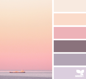
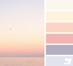
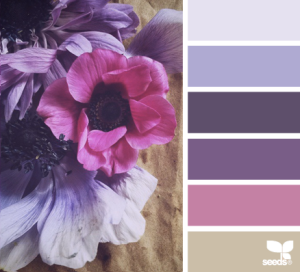
Hopefully, that helps a bit- I know there’s a lot of information going on there, but if you take your time, consider the guidelines and try a few different combinations out until you find one you like! Or, head over to Designs Seeds, as they have some fantastic colour schemes put together


[…] Choosing Colours July 5, 2015 […]
LikeLike
[…] Choosing Colours July 5, 2015 […]
LikeLike
[…] Board Games and Wedd… on Choosing Colours […]
LikeLike
[…] Board Games and Wedd… on Choosing Colours […]
LikeLike
[…] Board Games and Wedd… on Choosing Colours […]
LikeLike
[…] What to do when Visi… on Choosing Colours […]
LikeLike
[…] Wedding Stationery E… on Choosing Colours […]
LikeLike
[…] colours and have everything made to match (in which case, pick what you like! I have a handy dandy guide to choosing colours post that you might like to check out if you’re at that stage of wedding planning). But, […]
LikeLike